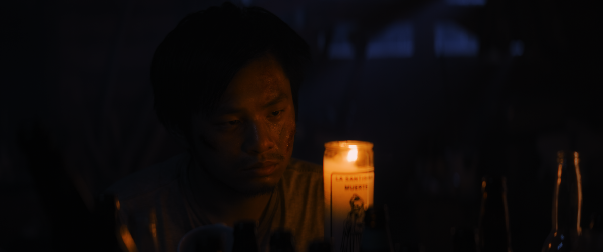
In Taka Tsubota’s post-apocalyptic short, four high school boys are stuck together holed up in a forest cabin after most of the world has been overrun by giant, spider-like creatures. Despite the horrors outside, one of the boys named Alan has to contend with the monsters with whom he shares the cabin. And there is only so much more that he can eventually endure.
Overlapping dialogue and imagery from different points in time, Tsubota uses a somewhat non-linear style of storytelling to catch the audience up with what has transpired. Dark silhouettes, and barely lit figures convey the teens’ increasingly desperate life of survival while also underscoring Alan’s grim situation.
The theme of human beings’ animal instincts when the situation allows has certainly been explored in literature and movies before. Bullying is just one form of that animal nature which does not need an apocalypse to manifest. But even in the world of Tsubota’s Canary, Alan’s tormentor Nev flexes his muscle in attempt to perpetuate his “big-man-on-campus” bravado in a tiny cabin after civilization has collapsed . But Tsubota smartly reminds the audience that the bully is weak; putting on a front of machismo and swagger to hide his own fears. Additionally, he distinctly points out the role of Nev’s enablers who don’t have the courage to defend Alan because they’d rather he be the victim than them.
However, Alan is at a breaking point and must make a choice: become as savage as the creatures from which they are hiding, or remain civilized–even human. It is a pivotal moment well acted by Barron Leung who displays the anguish of being a victim and the hard choice before him. In a time where there are no rules or teachers, he could do what his heart most desires. But unlike his cabin-mates, Alan seemingly makes the courageous choice to be better. This does not mean, however, that his tormentors will go unpunished.
Allowing sound, light, shadow, and emotion to carve out a microcosm of barbarity occurring between four teens in a cabin at the end of days, Tsubota’s Canary is an understated genre update on the theme of humankind’s stubbornly uncivilized nature.
Canarywill world premiere at the LA Shorts International Film Festival on July 24th.
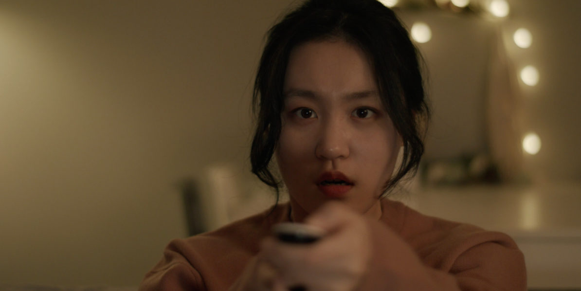
Taking cues once again from real world issues, industry meta, and in this specific case–according to the press notes–personal experience, Nakanishi Mai’s latest short movie begins simply enough. A young woman is talking with a friend on the phone just as she begins watching her favorite TV series. She swoons to the romantic scene playing out between a young couple. But then, something goes awry with the broadcast before the situation turns nightmarish.
In an economical six minutes, Nakanishi touches on the sense of fear and apprehension that stems from situations or events which are beyond our control but nevertheless can wreak havoc on our lives. On a more intimate scale, given the story’s set up, she also addresses how social and maybe even traditional media or technology has perhaps made all of us vulnerable on many levels to “intrusion”, “abuse”, and even “violence” from people we don’t even know.
The runtime may be too short for Nakanishi’s fans, but the compactness of this vignette is appropriate enough to convey the severe violence that can suddenly visit an unsuspecting person or someone living under a constant state of fear. Simultaneously, the way with which this story unfolds also seems like Nakanishi is pushing against the atmospheric, tension-ratcheting dread for which she’s already becoming known. Perhaps she will develop Border into a longer format through which she can explore a more aggressive brand of horror.
Border will be available as part of the 2023 Short Shorts Film Festival & Asia’s online screenings from April 27th to June 6th ahead of the in-person event.
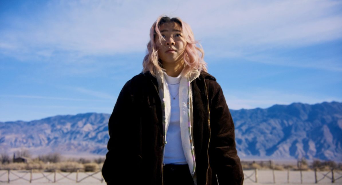
Found the trailer for this drama dealing with third and fourth generation Japanese Americans confronting their personal ties as a family, and identity as Americans, to the internment of Japanese Americans in concentration camps after the bombing of Pearl Harbor. There’s a heartfelt mix of soul searching and comedy on display as the story unpacks the figurative and literal meanings of “digging up one’s past.”
Director Paul Daisuke Goodman had this to say:
Who has heard of Manzanar? Or Rohwer or Tule Lake? No-No Boys and loyalty questionnaires and the American Concentration Camps? This is the history that I grew up with as a fourth generation Japanese American whose ancestors were evicted from their homes and put into concentration camps after the bombing of Pearl Harbor in 1941. Many of the people who worked on this film and almost every Japanese American can trace their way back, one way or another, to a camp in some desolate corner of the country. No No Girl is just one of the stranger-than-fiction stories that have been so underrepresented in today’s narrative storytelling….
Goodman’s own personal tale almost seems ripe for dramatization as well. While he was writing the script for No No Girl, he was also battling a relapse of cancer in 2020 at the height of the pandemic. Goodman would start principal photography six months after being discharged from the hospital.
I suspect both the movie’s story and Goodman’s own triumphs to make it will attract a lot of invites from Asian American and hopefully international film festivals as well.
Here’s the trailer:
More about the movie is available at Goodman’s production company’s website here.
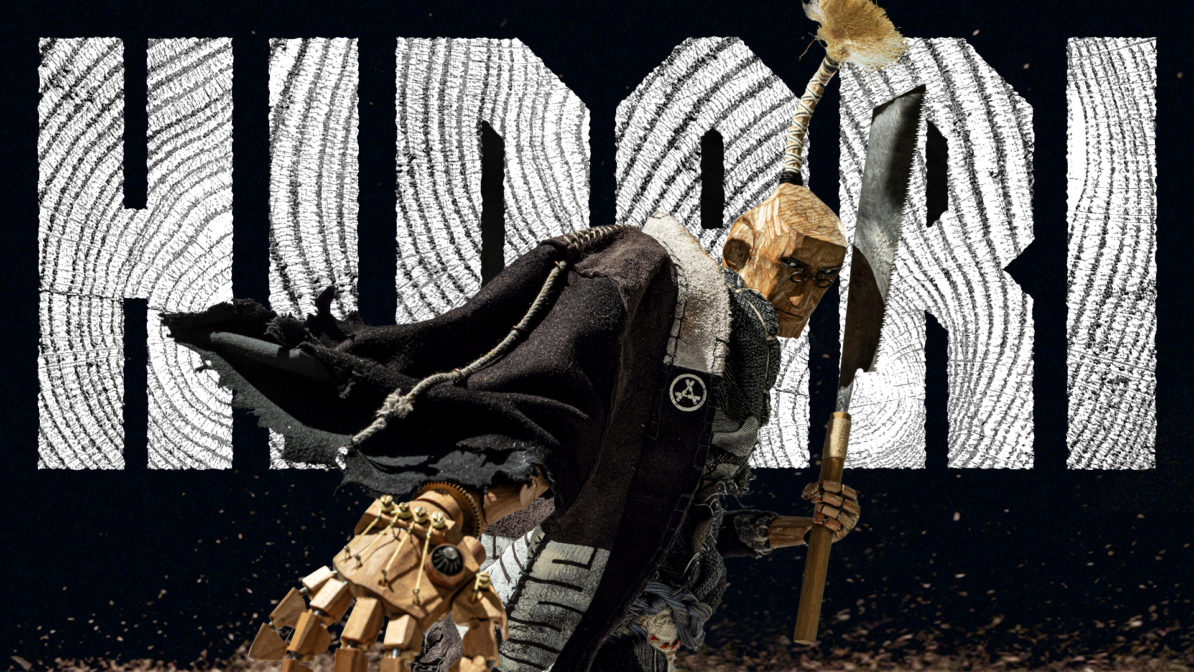
Check out this stop-motion animated short titled HIDARI. The filmmakers wanted to blend traditionally crafted figures animated through stop-motion with the dynamic storytelling found in Japanese anime and manga.
More details about the story and the project’s background can be found here on the official homepage of the production house, Whatever.
This short is merely a pilot–a proof of concept–the director and creative team are using to pitch to studios, streaming platforms, and producers in order to make a feature length. They are running a Kickstarter to fund those activities. Click here to check out the project and rewards.
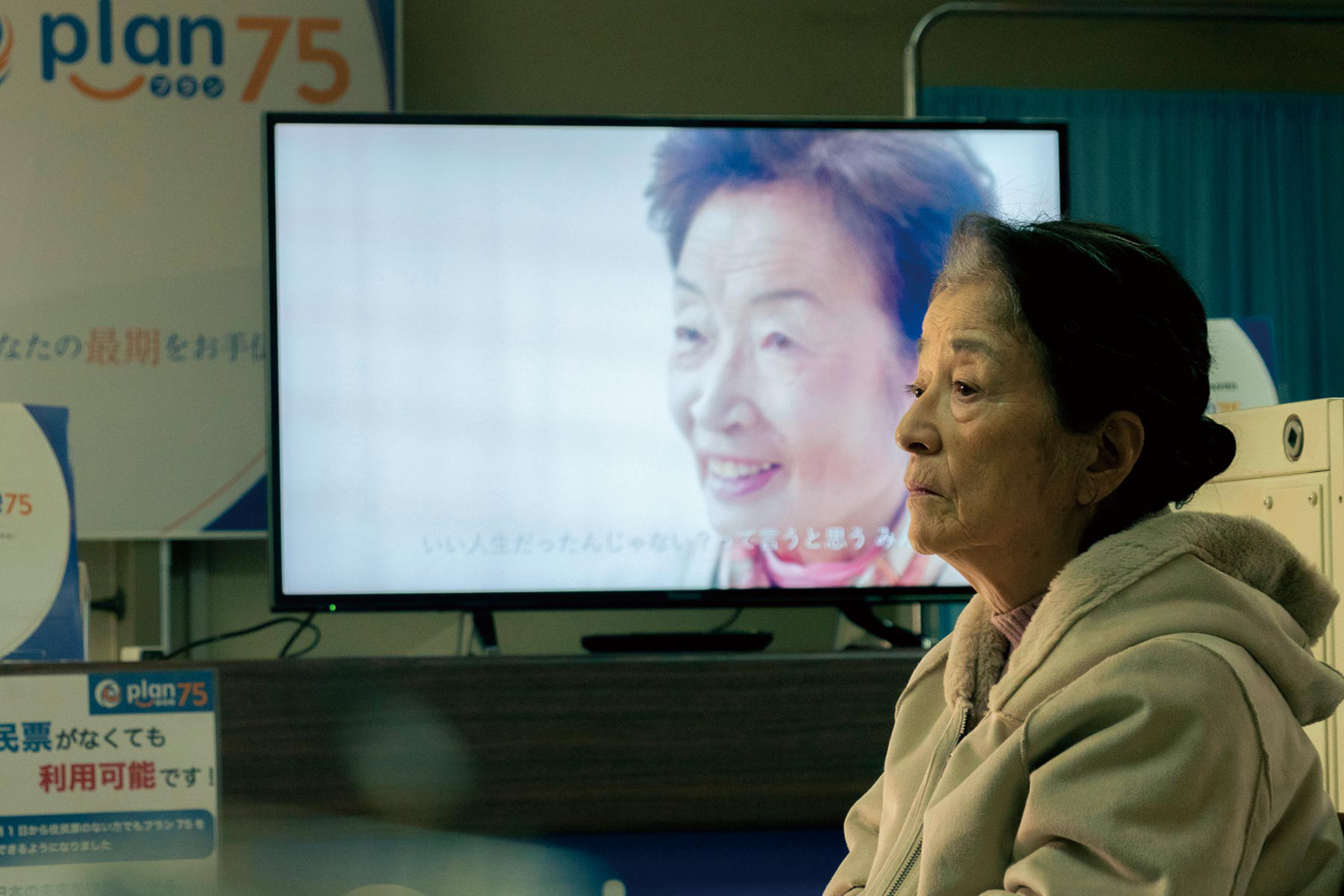
Plan 75 opens with a vague image of a dark place. There is a report from a shotgun. A shadowy figure runs in fear. Another shadowy figure emerges, on the prowl. After a moment, another shot is heard. Before long, the perpetrator can be seen relaying their manifesto either on audio or video–something about ending people’s suffering in order to make the country’s future brighter–before turning the shotgun on themselves. It’s an outlandish scene depicting the unthinkable massacre at a care home for the elderly, but is sadly based on an actual crime which took place in Japan. It is the perfect preface for the movie’s core conceit, that no matter how outlandish the plot may seem, it is not beyond the realm of possibility.
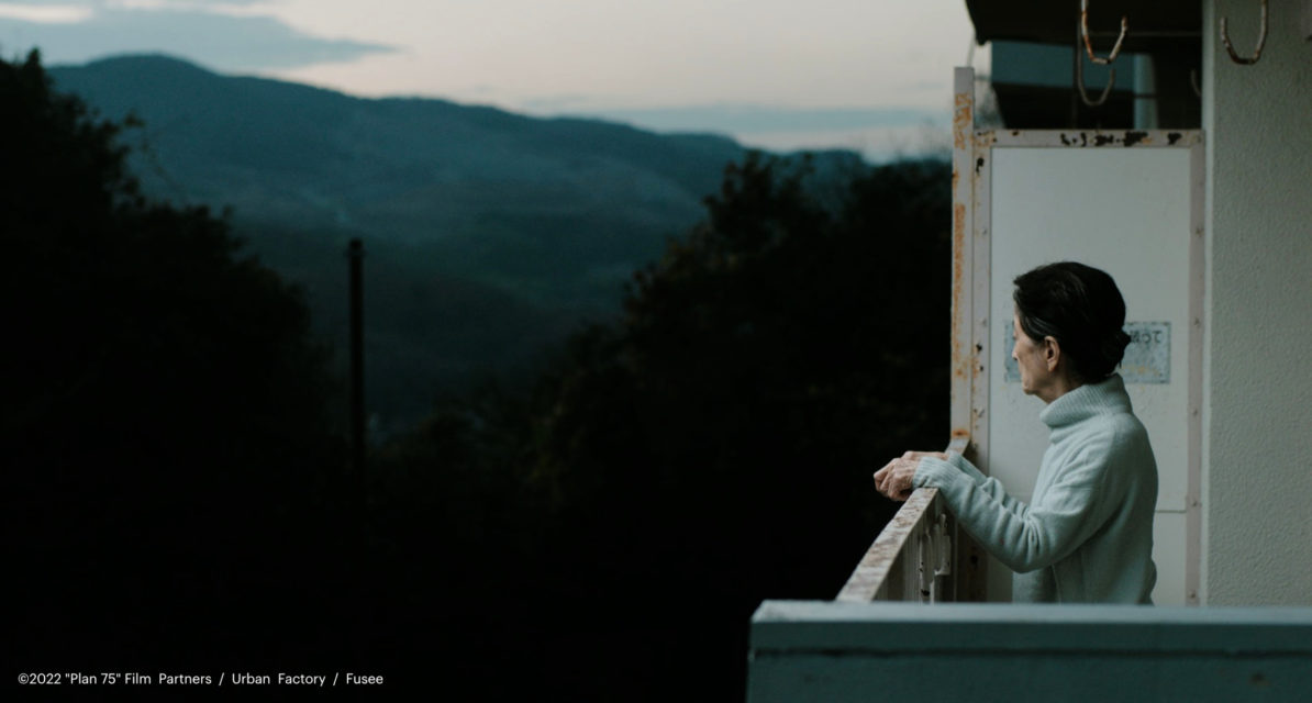
The scene then changes to a hotel hallway and a housekeeping cart bathed in light by an open door. A news report coming from a radio describes the massacre at the care home, and how the government is initiating the Plan 75 program in response to this and a rise of violent crimes against the elderly. Michi, the protagonist played by veteran actress Baisho Chieko, emerges from the room as she goes about her job as a cleaning maid. She is a sharp and energetic person who does her job diligently and efficiently. More importantly, the job affords her the companionship of her co-workers who are also around the same age. They spend time with one another both on and off work. It’s obvious the job is as much about companionship as it is financial necessity.
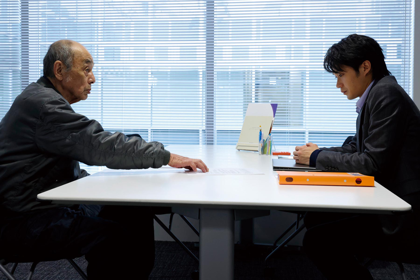
At its heart, Plan 75 is about community, and more specifically the loss of a sense of community. This is seen through the perspectives of four characters, Michi being one of course. The second is Hiromu, a young Plan 75 case worker. He is dedicated and professional, but also thoughtful and compassionate. Third is Yoko, a Plan 75 call center operator whose job is to lend a willing ear to people facing doubts or apprehension as the termination date approaches. Finally is Maria, a Filipino care worker at a senior home working to save money for the operation her daughter in the Philippines needs. However, her salary just isn’t enough so she turns to her church community for help.
The intersection of these four characters’ lives brings into sharp focus who are the eventual casualties of the sort of egocentrism and indifference that has been eroding away at the collaborative support typically found in communities. Instead, other people’s problems are theirs to solve. An elderly woman who appears to be need assistance using the computer isn’t paid any attention. And it’s an annoyance when there’s no option but to deal wth her. Empathy and engagement are in the decline. It’s the only way Plan 75 could ever come into existence, and how it will be maintained. Impersonality and disengagement are even built into the system. Hiromu is removed off a case–and dutifully accepts the reassignment–when a connection to the applicant creates a “conflict of interest.” Yoko is to be a caring voice to her callers, but she is not to care. She is by no means to connect personally with the caller, a fact of which she’s reminded when she overhears a familiar orientation for new hires. Maria is sternly instructed not to engage with the elderly at the euthanasia facility where she begins working.
But these are people, not figures to balance on a ledger nor obstacles to be swept aside. Intrinsically, the characters understand this. Hiromu secretly reaches out to that case from which he was reassigned and at least attempts to give one client some personal dignity while also reconnecting with him. Yoko accepts an invitation the rules tell her she is not to do, and gives her caller an enjoyable evening enveloped in the energy of youth. Then there is Maria, supported by a giving community, she doesn’t hesitate to help someone at the facility because she knows it’s the right thing to do.
Initially a chapter of the Ten Years Japan anthology the Plan 75 short movie was inspired by director Hayakawa Chie’s anger toward the actual crime on which the opening scene is based, and the shock she felt at what Japanese society had become after returning from living abroad. As a result, the short possessed a pervading sense of hopelessness. However, Hayakawa stated she had the time to process her feelings as she developed the feature-length. In the short, an elderly man (who appears in the movie as Hiromu’s first client) says to a recruiter, “Is a long life a disgrace?” It seems obvious she intends for the theatrical version to answer that question with a resounding, “No!” Moreover, through some truly heartbreaking scenes of Michi sublimely performed by Baisho in the second act Hayakawa simultaneously asks the audience: “Are you okay with this? Doesn’t she deserve better?”
This is all heavy material which might normally suffocate a narrative, but the brilliance of Hayakawa’s script is she never resorts to being preachy nor overly melodramatic. Following the movie’s premiere at the Cannes Film Festival, Hayakawa often reiterated in interviews that she wanted Plan 75 to affirm life. She has resoundingly accomplished that–and more–through genuinely truthful characters living in a world that could become our own despite its high concept. Kudos to Hayakawa, Baisho Chieko, the cast, and the producers for crafting an elegantly credible cautionary tale while also serving as a quietly blistering call to give a damn for our fellow human being and our overall communities.