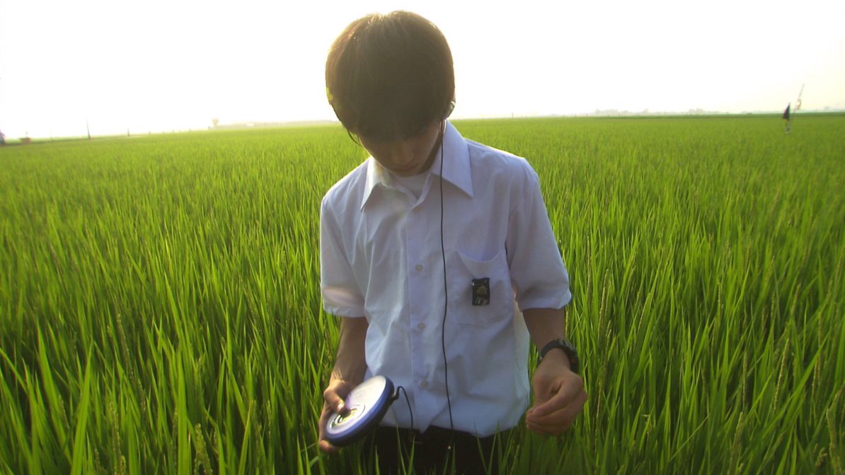
In Lily Chou-Chou, the solace of the teens’ online community contrasts with the brutality of their face-to-face interactions. Online, as anonymous users, they reap all the rewards of companionship and sharing feelings without the risks of being seen—and seen as vulnerable.
Filmmaker magazine has a great write-up celebrating Iwai Shunji’s movie about people having greater connections online than they do in real life. Though it’s doubtful Iwai was intentionally divining what social media has become today, his story about teens finding solace in their online persona back in the the day of dial-up BBS communities now appears as nostalgic as period pieces harkening to a bygone day “when things were simpler,” perhaps even better. Now those brutal interactions mentioned in the quote above have become the bread & butter of social networks.
Read Joanne McNeil’s article on Filmmaker’s website here.
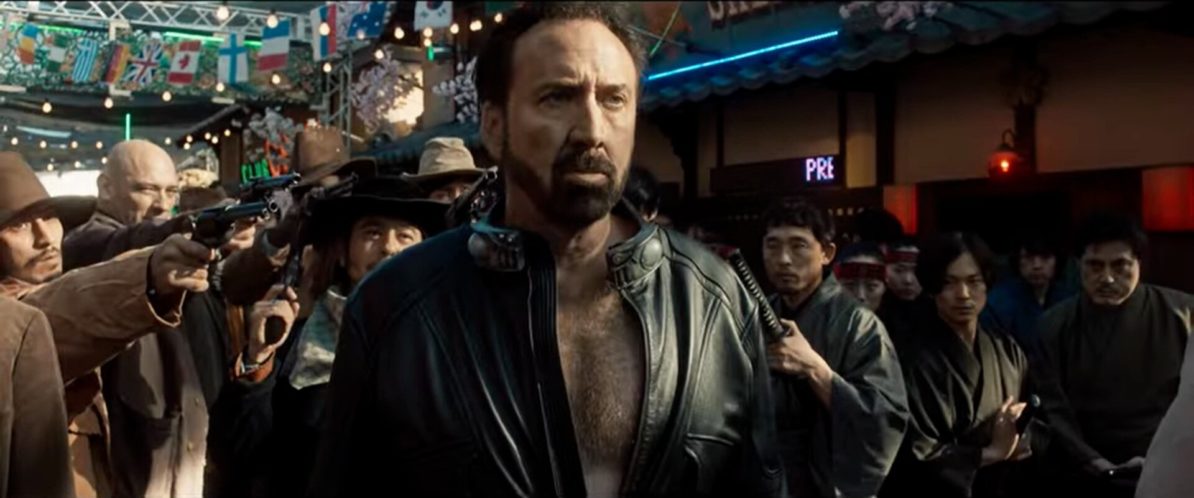
Maverick filmmaker Sono Sion has made a movie with Nicholas Cage. The result? Cage claims it’s “The wildest movie I’ve ever made.” Considering, Cage’s recent output, that’s quite the boast. But certainly what has come to be expected of Sono. Watch the trailer below.
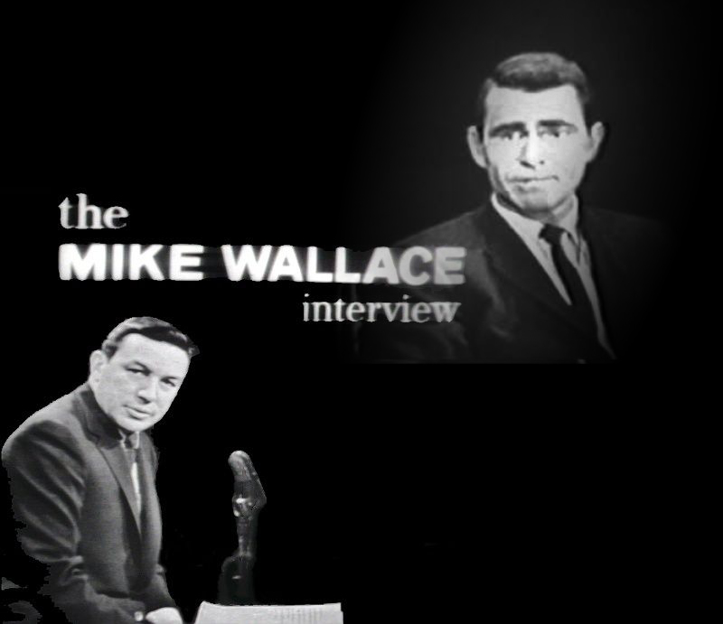
Fascinating interview with one of my favorite screenwriters, Rod Serling. Everything I know about society and human beings was highly influenced by the Twilight Zone. There are topics raised which are very much salient today, particularly when it comes to censorship and pre-censorship as they concern the public’s relation with the sponsors of television stations and/or programming.
No one could have predicted how these issues would be exacerbated by social media in the modern era, and that there is still a tug-of-war happening between content providers and the “letter writer” now that the traditional advertising model of sponsorship has been replaced by the subscription model. Many streaming services are taking more chances and are deliberately tackling controversial topics because they are afforded some greater freedom than the broadcast network of the 50s thru to the turn of the millennium. However, that freedom is not absolute as venture capital and stock investors can play a similar role now as corporate sponsors did then.
Sadly, the politicization and polarization of issues on who decides what people see is overshadowing the vastly more important intent of such stories to draw attention to and help us examine our current circumstances.
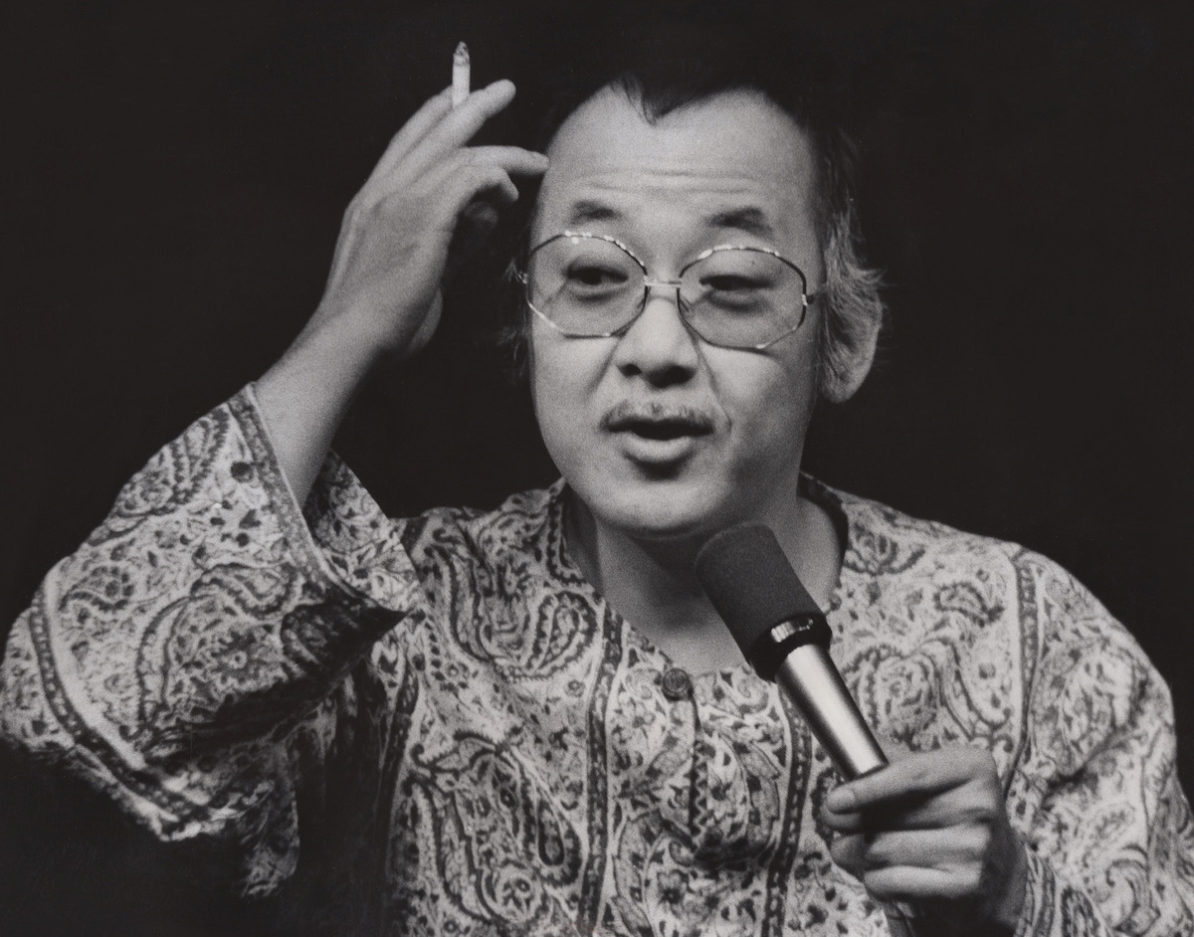
Trailer for the documentary on the life of a beloved actor who is remembered in a very specific way while forgetting about the entire career he had, plus the untold stories now coming to light. An appropriate title for a film being released at a perfect time.
In Part One of the journey toward the creation of Indievisual’s masthead, I delved into the research of the logos and mastheads of established entertainment companies and publications. These began the thought process of conceptualizing which direction would be appropriate for Indievisual. The next phase was to look into appropriate typefaces before creating a masthead emblematic of the magazine and its mission.
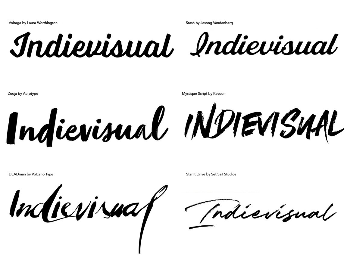
With Lagom fresh in my mind, I first sought similar script typefaces. As I looked through samples, however, I was never really satisfied with the results. I believe this might have been a result of the letters forming Indievisual were less condusive to producing equally elegant yet bold results compared with Lagom. Likewise, some appeared too much like Interview due to the resemblance in spelling. And some were just illegible. Such handwritten scripts certainly suggested a rebellious and provacative spirit, but I was not comfortable with the glaring “attitude” they also projected. Ultimately, it was important for me to also admit trying to find a typeface similar to Lagom was aping the publication’s unique identity and thus reducing the value of my own.
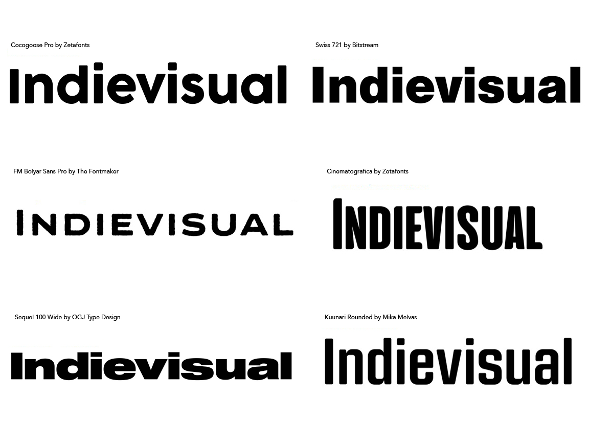
I then looked at sans-serif typefaces. There are a number of good examples of sans-serif mastheads among the research, particularly within the entertainment industry. The sample results were quite intriguing. I found my eye drawn to modern, geometric typefaces–the shape of the letters based on near perfect geometric shapes–for their uniform spacing and overall legibility. However, strict geometric typefaces also seemed cold and lacked a “human” element. They made for fantastic mastheads, but perhaps not for Indievisual. On the other hand humanistic sans-serif typefaces did have some of those variances in thick and thin lines which emulated handwritten text, but with the precision of a typeset form. Other typefaces mimicked a hand stamped or block print effect with imperfections in their shape or mock “print”. Other considerations were the width of the typeface. Given “Indievisual” is 11 letters long, some wide and display typefaces appeared too unwieldly and overbearing. Block sans-serifs were definitely not appropriate. However, tall typefaces or condensened type styles were not attention grabbing enough unless heavily bolded.
After examining two possibile letterforms, what became apparent was my gravitation toward more standard, less specialized typefaces, but with humanistic touches rather than being entirely uniform in line weight. This also highlighted the reason masthead design stays within definite parameters of typefaces and styles. There are many great typefaces available in the digital age for which many uses are possible, but when applied to an identity, adhering to lettering fundamentals usually works best. As a result, the search for serif typefaces was less hit-or-miss. From what I already learned, I avoided highly specialized typefaces or those which were formal, classical type and instead focused on humanistic typefaces as their stroke variations was obviously an important symbol of the hancrafted quality suggestive of independent filmmaking that is integral to Indievisual’s image.
Some of these have fanciful glyphs which definitely convey not only a human touch, but a bit of personal “flare.” It is clear humanistic serif typefaces were a happy medium between the handwritten qualities of script and the modern geometry of certain sans-serif typefaces seen previously. Moreover, typefaces with slab serifs–heavy strokes attached to the main strokes comprising letters (the top and bottom part of a capital “i” for example)–projected a strong presence while allowing the letterforms to project their individual characteristics. This is no surprise as slab serifs were originally developed to be attention grabbing elements for posters but were also suitable for small print thanks to the “rows” implied by these bolder serifs thus making them ideal for newspaper printing. While there were a few sans-serif typefaces I found appealing, the powerful presence slab-serif typefaces projected could not be ignored.