In Part One of the journey toward the creation of Indievisual’s masthead, I delved into the research of the logos and mastheads of established entertainment companies and publications. These began the thought process of conceptualizing which direction would be appropriate for Indievisual. The next phase was to look into appropriate typefaces before creating a masthead emblematic of the magazine and its mission.
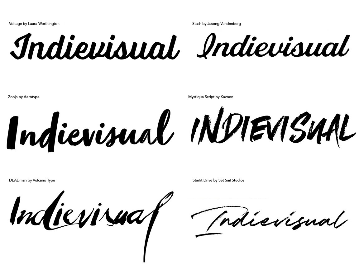
With Lagom fresh in my mind, I first sought similar script typefaces. As I looked through samples, however, I was never really satisfied with the results. I believe this might have been a result of the letters forming Indievisual were less condusive to producing equally elegant yet bold results compared with Lagom. Likewise, some appeared too much like Interview due to the resemblance in spelling. And some were just illegible. Such handwritten scripts certainly suggested a rebellious and provacative spirit, but I was not comfortable with the glaring “attitude” they also projected. Ultimately, it was important for me to also admit trying to find a typeface similar to Lagom was aping the publication’s unique identity and thus reducing the value of my own.
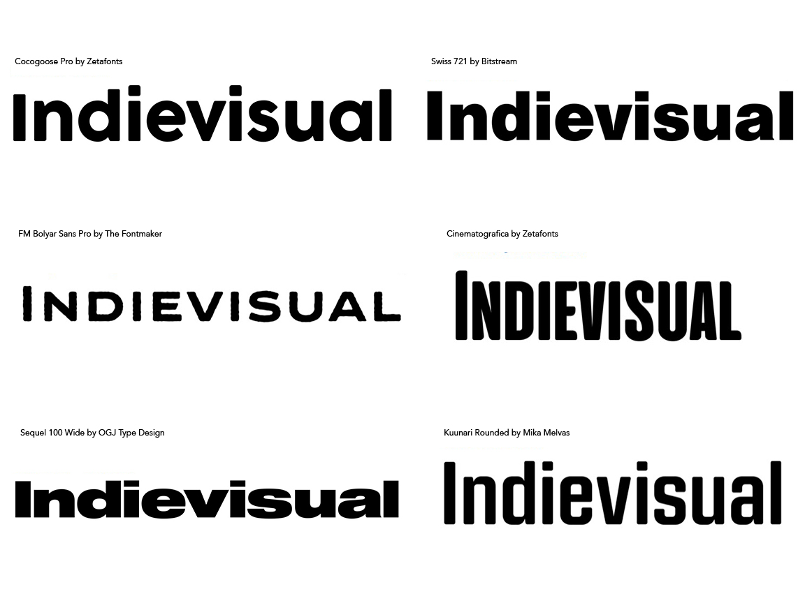
I then looked at sans-serif typefaces. There are a number of good examples of sans-serif mastheads among the research, particularly within the entertainment industry. The sample results were quite intriguing. I found my eye drawn to modern, geometric typefaces–the shape of the letters based on near perfect geometric shapes–for their uniform spacing and overall legibility. However, strict geometric typefaces also seemed cold and lacked a “human” element. They made for fantastic mastheads, but perhaps not for Indievisual. On the other hand humanistic sans-serif typefaces did have some of those variances in thick and thin lines which emulated handwritten text, but with the precision of a typeset form. Other typefaces mimicked a hand stamped or block print effect with imperfections in their shape or mock “print”. Other considerations were the width of the typeface. Given “Indievisual” is 11 letters long, some wide and display typefaces appeared too unwieldly and overbearing. Block sans-serifs were definitely not appropriate. However, tall typefaces or condensened type styles were not attention grabbing enough unless heavily bolded.
After examining two possibile letterforms, what became apparent was my gravitation toward more standard, less specialized typefaces, but with humanistic touches rather than being entirely uniform in line weight. This also highlighted the reason masthead design stays within definite parameters of typefaces and styles. There are many great typefaces available in the digital age for which many uses are possible, but when applied to an identity, adhering to lettering fundamentals usually works best. As a result, the search for serif typefaces was less hit-or-miss. From what I already learned, I avoided highly specialized typefaces or those which were formal, classical type and instead focused on humanistic typefaces as their stroke variations was obviously an important symbol of the hancrafted quality suggestive of independent filmmaking that is integral to Indievisual’s image.

Some of these have fanciful glyphs which definitely convey not only a human touch, but a bit of personal “flare.” It is clear humanistic serif typefaces were a happy medium between the handwritten qualities of script and the modern geometry of certain sans-serif typefaces seen previously. Moreover, typefaces with slab serifs–heavy strokes attached to the main strokes comprising letters (the top and bottom part of a capital “i” for example)–projected a strong presence while allowing the letterforms to project their individual characteristics. This is no surprise as slab serifs were originally developed to be attention grabbing elements for posters but were also suitable for small print thanks to the “rows” implied by these bolder serifs thus making them ideal for newspaper printing. While there were a few sans-serif typefaces I found appealing, the powerful presence slab-serif typefaces projected could not be ignored.
This was the direction to pursue. The journey from what I thought I wanted to what I felt was approriate essentially brought me back to the basics. As much as I wanted some form of fringe, unconventional masthead, taking the time to look at the word “Indievisual” spelled out in various typefaces convinced me otherwise. More importantly, I could see an elegant solution in humanist shapes with slab serifs which creatively and typographically fulfilled the desired image I hoped to project. There were two important factors to keep in mind when deciding upon candidate typefaces. The first is to choose typefaces which did not reference a particular time period. While beautiful, certain typefaces are meant to recall a particular era and are appropriate for designs hoping to tap into such nostalgia. The second, and ultimately most important, is which typefaces could be used free of charge. All the sample typefaces displayed so far must be paid for in order to be used for commercial and even personal purposes. A typeface’s complete font family including all weights and styles can often run into the thousands of dollars. It’s possible to purchase only the weight and style I hope to use, but even these instances can be cost prohibitive, especially when there is no budget to speak of. Therefore an exhaustive quest began for typeface fonts which could be used legally for free but in some way replicates those I had found in my research. The final candidates are below.
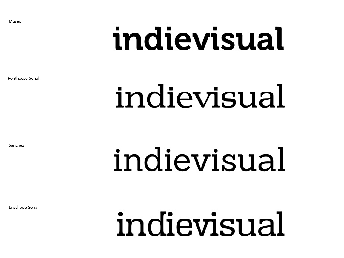
Beginning from the top is the Museo typeface. This is a contemporary typeface with interesting rounded serifs that hint at connections between letters such as the “v” and “i”. There are subtle stroke variations in the “n,” “u,” and “a,” and overall bear a balanced geometry which give it a contemporary sophistication. However, this is currently a popular typeface and therefore the masthead could quickly look out-of-date when trends shift in a different direction.
Penthouse Serial is very much a transitional typeface in that is bears some of the qualities of old-style (waisting in angled strokes) but more prounounced with thicker, squarish serifs. The letters have a bit more width than height and here the “v” and “i” do connect which creates a pleasant accent. There is a lot to like about this typeface aesthetically. If it has any drawbacks they are the height of the “d” and “l” as well as the “square” dotting the “i”. Overall, the typeface exudes an odd familiarity. Somewhere there are publications with a masthead that appears just like this one.
Third is Sanchez. It’s a display typeface, meaning it was designed for larger sizes, such as headlines, titles, and other applications where the type is the primary focus. Its regular weight also bears prominent slab serfis and is slightly taller than wide. There is less variation between thick and thin lines, though those subtle variations become more pronounced as the weights increase toward bold or black styles. It is a beautiful typeface with enormous potential, but the only weight available for free was the regular style which unfortunately lacks the same visual punch as its bold or black variants.
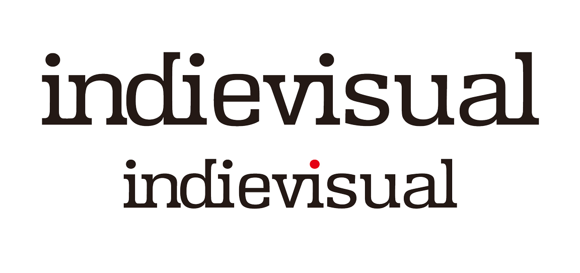
Enschede Serial is the fourth and final candidate. The typeface has an overall thickness equivalent to its slab serifs which helps it stand out. Humanistic elements are subtle but still evident. Height is a pinch greater than width, but more interesting is the heighest point of the “d” and “l” are at around the same level as the dots of the “i” which are quite prominent compared to the other candidates. The tighter letter spacing also creates relationships among all the letters’ serfis leading to greater visual impact. More importantly, it has a unique serif on the top of the “d” which points in the opposite of normal and once again creates implied connections between neighboring letter elements. However, the typeface is so weighty it could be more akin to traditional publications than one born during the era of new media.
I set these aside for a time, allowing myself time to forget how they and every other typeface looked like. Meanwhile, I once again thought about what Indievisual is and what I hope to accomplish through the magazine and other services. After cafeful consideration, I chose Enschede Serial. Despite initially being turned off by this typeface projecting a more traditional media image, I ultimately had to admit that I myself was raised on traditional media, reading many of those same publications researched in Part One and watching authentic news journalists on television. I was cut of that cloth at least in the sense of my education and writing temperment. Enschede Serial matched this core upbringing well while still being unique in its own way compared against Penthouse Serial or Sanchez. And in my mind that opposite serif of the “d” created enough “oddity” to suggest a “going against the grain” image amidst its professional demeanor, like a businessman who wears an amusing tie or playful accent somewhere on his otherwise straightlaced suit. Morever, the type style offered for free was thick enough to be useful as a masthead and other functions in large or small sizes (see the Indievisual Instagram profile picture). Though Museo has a thicker bold style, its contemporariness certainly worked against it. Finally, to make the typeface a bit more unique to Indievisual I did connect the slab serifs between letters that are normally unconnected just to create a consistency with the connected “v” and “i”. In color useage, the dot on the third eye can be made red, harkening all the way back to iconography and how to symbolize “Japan” by referring to its flag.
The logotype has served well on my business card and of course on the Indievisual magazine site. I’m in the process of creating other branded designs and so far the positive aspects which pushed it ahead of its competitors are continuing to be the reasons it succeeds as Indievisual’s masthead and logo. But I have found the somewhat wide proportion combined with the 11-letter-long spelling did create some issues for an item given to interviewee directors. Its length did not allow for it to be printed at a cut size I originally specified, neccissating the next larger size which in my eyes seems a bit too big. A taller typeface in this instance would have worked better. Be as it may, I am happy to have gone on this journey in search for the proper typeface. My initial desires proved incorrect after thoughtful consideration and an evaluation of what each typeform and typestyle offered in ways of imagery and personality. Had I not gone through the process, I may have created a masthead more intent on projecting an attitude instead of embodying a principle. As stated previously, mastheads do undergo changes over time. There may be a redesign in the future as Indievisual’s mission and audience become clearer or changes. The research did produce intriguing alternatives should a change be required. For the time being, the current masthead I believe embodies the statement: “a personal endeavor of a movie buff to humanize filmmakers and call attention to their individualistic works through a rebellious spirit but professional manner.”
Feature image by explorenation # on Unsplash